I remember the first time I thought about logos as a thing.
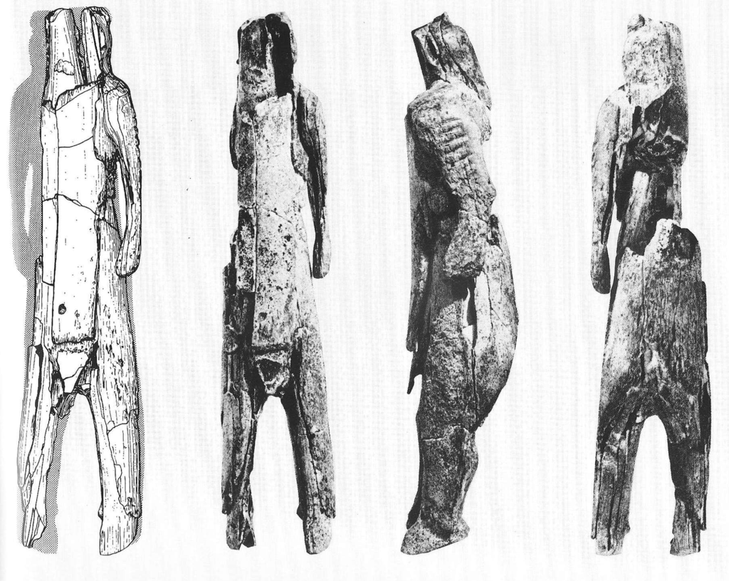
In the opening section of Sapiens, Harari describes the legend of Peugeot. He describes how the Stadel lion-man, from the Stadel caves a few hundred miles away from where Peugeot started, became the logo for the car manufacturer and with it gave Peugeot an identity above and beyond the machinery, buildings and people that work there.
“Peugeot has managers and shareholders, but neither do they constitute the company. All managers could be dismissed and all its shares sold, but the company itself would remain intact.”
Combined with our ability to abstract, a logo can become a container for so much information. The sports imagery, sponsorship deals where you see Nike plastered on billboards concentrate in the Swoosh.
I expect this explains why logos tend to be abstract. For example, Peugeot chose the Stadel lion-man and not a car as its logo, which creates the ‘space’ to load on meaning. The Apple logo is quite clearly an apple but Steve Jobs was selling PCs after all. In fact, I struggle to think of examples where the logo is a concrete depiction of the product or service.
Since paying closer attention to logos recently I’ve made a few observations.
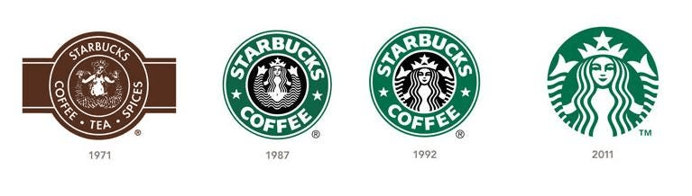
Firstly, the growing digital sphere has led a trend towards simplification. Starbucks is case in point but many brands have simplified their logos over time, removing intricate details and 3D shapes, focusing instead on flat 2D, cleaner designs. This follows a wider trend towards minimalist design, and with the need for logos to be versatile and recognizable across digital platforms by default.
Secondly, animals are very popular. I couldn’t find any meta studies, but from observation this feels to be the case especially with car markers (e.g. Jaguar cars) and in sports, and other areas where the thing is in motion. Animals have loads of symbolism that we collectively understand e.g. the lion as the strong and powerful ‘king’ and the owls as wise etc etc.
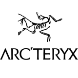
I’ve noticed how animals are popular with activewear brands (e.g. Mammut) where there is also a tendency for bones and skulls. All Saints and Arc’teryx are case in point. The link between modern clothing and the bone jewellery worn by our prehistoric ancestors feels significant, and no doubt donning an All Saints hoodie conjures similar symbolism: connecting to nature, warding off bad spirits and the bringer of good luck.
There’s a fascinating link with Carl Jung’s conception of the collective unconscious (i.e. the inherited structure of the brain) that contains the archetype images and ideas that a shared by a culture.
Thirdly, some brands don’t have an image at all and just work with font (which I learned is called a ‘wordmark’). I suspect companies like Sony go this way because making a single image work across a large range of products is nigh on impossible and has helped them sell into different markets where colours and images might have different meanings. I suspect what I’ll dub the “Helvetica black” movement will ebb with the end to globalisation as we knew it and what comes next.
